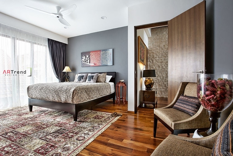
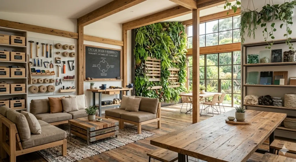
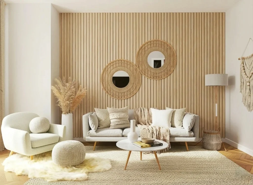
Choosing the right colour palette for a room is one of the most important decisions in interior design. Colours influence how a space looks, feels, and functions, affecting everything from perceived room size to mood and comfort. Rather than simply selecting your favourite shades, an effective colour palette creates harmony between walls, furniture, lighting, and décor while supporting the purpose of the space.
Whether you’re renovating a compact apartment, an HDB flat, a condominium, or a landed property, understanding how colours work together helps you create interiors that feel cohesive and timeless. At ARTrend Design, colour selection is always considered alongside layout, materials, lighting, and lifestyle to achieve a balanced and practical design.
Why Choosing the Right Colour Palette for a Room Matters
The right colour palette for a room does much more than improve appearance. It establishes the atmosphere, influences spatial perception, and creates visual consistency throughout the home.
A carefully planned palette can:
Make small rooms appear larger and brighter.
Create warmth and comfort in living spaces.
Improve focus in work or study areas.
Encourage relaxation in bedrooms.
Ensure furniture and finishes complement one another.
Instead of treating colour as a finishing touch, professional interior designers typically consider it early in the design process so every element works together seamlessly.
Factors to Consider Before Choosing Colours
There is no single perfect palette for every home. The best choice depends on several practical considerations that affect how colours appear throughout the day.
Natural Lighting
Rooms with abundant natural light generally accommodate darker or cooler shades more comfortably, while spaces with limited daylight often benefit from lighter colours that reflect more light.
Morning and afternoon sunlight can also change the appearance of paint colours, making sample testing an essential step before making a final decision.
Room Function
Different spaces have different purposes, so the colour palette should support how the room is used.
Room
Recommended Colour Direction
Living room
Warm neutrals, earthy tones, soft greens
Bedroom
Muted blues, sage green, warm beige
Kitchen
White, light grey, soft wood tones
Home office
Blue, green, neutral grey
Dining room
Warm earth tones or elegant neutrals
Existing Furniture and Materials
Flooring, cabinetry, countertops, curtains, and upholstered furniture should all influence your colour choices. A successful palette complements these permanent elements rather than competing with them.
Personal Style
Modern interiors often feature neutral palettes with subtle contrasts, while Scandinavian, Japandi, contemporary, industrial, and minimalist styles each have their own preferred colour combinations. Selecting colours that match your overall design style helps create a cohesive result.
Popular Colour Palette Styles Compared
Different colour palettes create different visual effects. Understanding their characteristics makes it easier to choose one that suits your home.
Colour Palette
Best For
Benefits
Considerations
Neutral
Most homes
Timeless, versatile, easy to decorate
Add texture to prevent a flat appearance
Earthy
Nature-inspired interiors
Warm, calming, welcoming
Works best with natural materials
Monochromatic
Modern and minimalist homes
Clean, sophisticated appearance
Use varying textures for depth
Complementary
Feature walls and accent spaces
High visual impact
Avoid excessive contrast
Analogous
Relaxing living spaces
Smooth colour transitions
Choose one dominant colour
A balanced palette usually includes a dominant colour, secondary colours, and carefully selected accent shades rather than giving every colour equal emphasis.
Pro Tip: Before committing to paint, test large colour samples on different walls and observe them at various times of the day. Lighting can dramatically change how a colour appears.
Understanding Colour Temperature
Colour temperature plays an important role in creating the desired atmosphere.
Warm Colours
Warm colours include:
Beige
Cream
Terracotta
Soft yellow
Warm taupe
These colours create inviting, cosy environments and are commonly used in living rooms and dining areas.
Cool Colours
Cool colours include:
Blue
Green
Grey
Lavender
They often produce a calm, fresh, and relaxing atmosphere, making them popular choices for bedrooms, bathrooms, and home offices.
Many successful interiors combine both warm and cool tones to create balance throughout the home.
How Lighting Affects Colour
Lighting has a significant influence on how colours are perceived. The same paint colour may appear completely different depending on the light source.
Natural daylight generally provides the most accurate representation of colour, while warm artificial lighting can make neutral shades appear creamier. Cooler LED lighting may emphasise blue or grey undertones.
Because of these variations, professional designers typically evaluate colour selections under both natural and artificial lighting conditions before finalising a scheme.
If you’re interested in the psychology behind colour choices, explore our guide on how colour affects mood in interior design to better understand how different shades influence emotions and everyday living.
When to Work with an Interior Designer
Selecting individual paint colours is relatively straightforward, but creating a cohesive colour palette across an entire home requires experience.
Professional interior designers consider:
Space planning
Natural and artificial lighting
Material selection
Furniture coordination
Architectural features
Lifestyle requirements
Choosing the right colour palette for a room is easier with professional guidance. ARTrend Design’s Residential Interior Design Services help homeowners create cohesive colour schemes that complement their home’s layout, lighting, and lifestyle
Conclusion
Choosing the right colour palette for a room involves more than selecting attractive paint colours. By considering lighting, room function, existing materials, and overall design style, you can create interiors that are comfortable, cohesive, and visually timeless.
If you’re planning a home renovation or looking for professional guidance, the experienced team at ARTrend Design can help you develop a personalised colour palette that complements your space and lifestyle.
FAQs (Frequently Asked Questions)
What is the best colour palette for a small room?
Light neutrals, soft greys, warm whites, and muted pastels often make smaller rooms feel more spacious and brighter.
How many colours should be used in one room?
A common approach is to use one dominant colour, one or two supporting colours, and one accent colour for balance.
Should every room have the same colour palette?
Not necessarily, but maintaining a consistent colour family throughout the home helps create a smooth visual transition.
Can lighting change paint colour?
Yes. Natural daylight, warm lighting, and cool lighting can all alter how paint colours appear.
Is it worth hiring an interior designer for colour selection?
Yes. An interior designer can develop a cohesive palette that works with your home’s layout, lighting, furniture, and long-term design goals.ation or redesign, start with colour clarity early. It saves time, cost, and regret later.