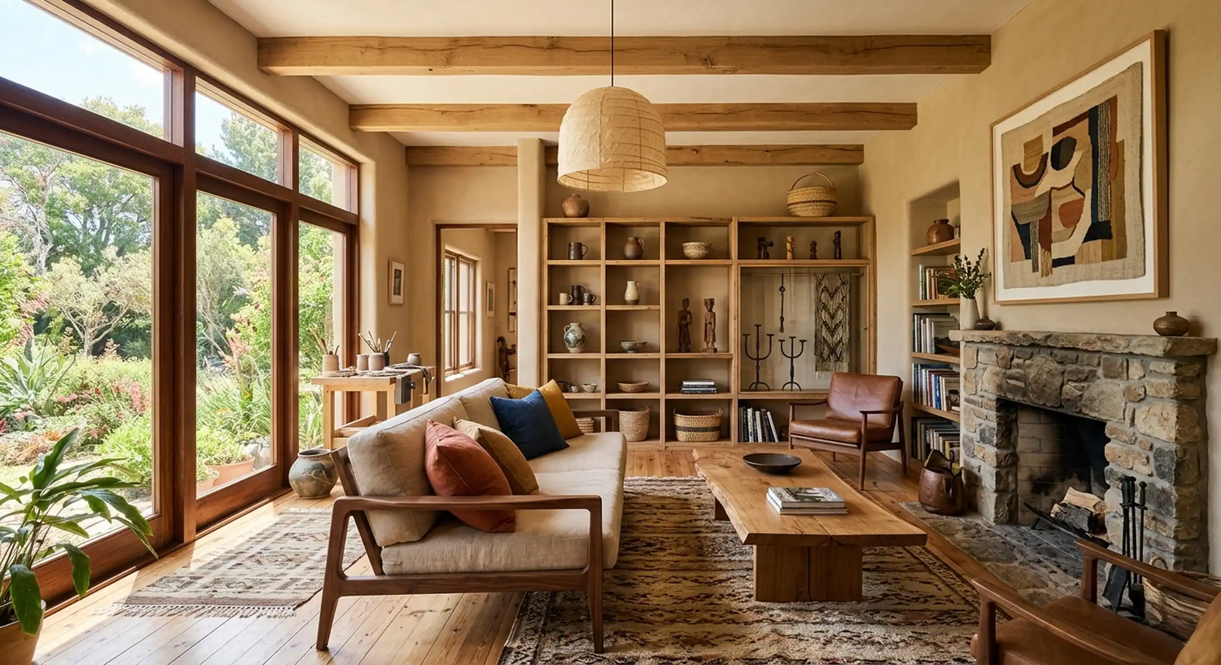
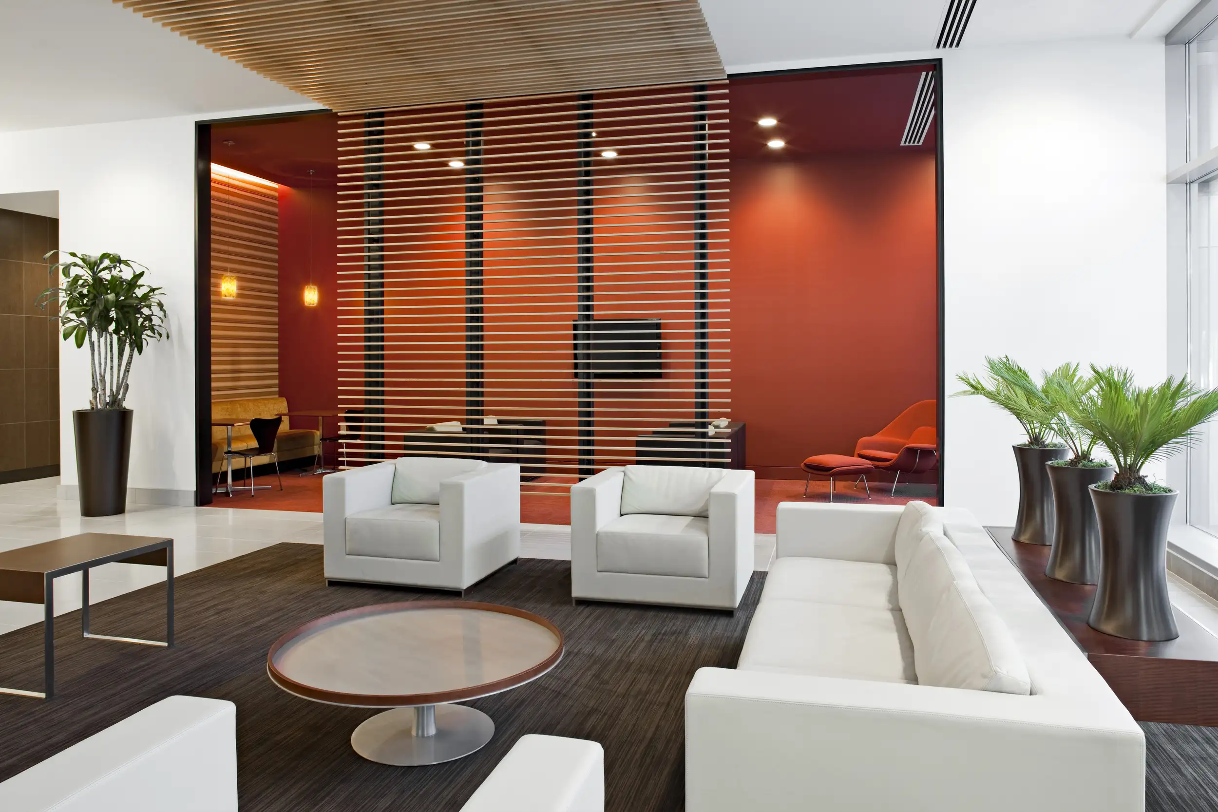
Interior design colour trends refer to popular colour palettes, combinations, and finishes used to create attractive, comfortable, and functional living spaces. The latest interior design colour trends focus on warm neutrals, earthy tones, nature-inspired greens, muted blues, and carefully selected accent colours. These shades help homeowners create interiors that feel welcoming without sacrificing modern style.
In Singapore, choosing the right interior colours is especially important because homes need to balance limited space, natural lighting, functionality, and personal preferences. Whether you live in an HDB flat, condominium, or landed property, a thoughtful colour scheme can influence how spacious, bright, and comfortable your home feels.
However, following every new trend is not always the best approach. The ideal interior colour palette should complement your furniture, lighting, flooring, and lifestyle. By understanding different colour combinations and how to apply them, you can create a home that looks contemporary today and remains appealing for years.
1. What Are the Latest Interior Design Colour Trends?
Interior design colour trends continue to evolve as homeowners look for more natural, relaxing, and personalised environments. Rather than relying entirely on bold colours, modern interiors increasingly combine subtle base shades with carefully selected accent tones.
Here are some popular colour directions worth considering for Singapore homes.
Warm Neutrals for a Comfortable Living Space
Warm neutrals such as beige, cream, ivory, and taupe remain popular choices because they create a welcoming atmosphere.
These colours work particularly well in living rooms, bedrooms, and dining areas. They also provide a flexible background for different furniture styles and decorative accessories.
Why choose warm neutrals?
Make interiors feel softer and more inviting.
Complement wooden furniture and natural textures.
Work well with minimalist and contemporary designs.
Provide a timeless foundation for changing decorations.
Earthy Colours Inspired by Nature
Earthy colours such as terracotta, clay, olive green, and warm brown bring a natural quality into indoor spaces.
These shades are particularly suitable for homeowners who prefer organic materials and relaxed interiors. Pairing earthy colours with timber finishes, stone textures, or indoor plants can create a balanced environment.
Soft Greens for a Relaxing Atmosphere
Sage green, eucalyptus, and muted olive are versatile options for modern residential interiors.
Green is often associated with nature and tranquillity, making it suitable for bedrooms, reading corners, and living spaces.
A sage green feature wall combined with light wood and cream furniture can create a subtle yet distinctive design.
Muted Blues for a Calm and Elegant Interior
Muted blue, dusty blue, and blue-grey introduce a sense of calm without making a room feel overly colourful.
These shades can work particularly well in bedrooms, study areas, and selected living room features.
For a balanced appearance, combine muted blue with warm white, beige, or light timber finishes.
The key is moderation. A few carefully placed accents can make a room memorable without overwhelming the overall design.
2. How Do You Choose the Right Colour Combination for Your Home?
Choosing colours is not simply about selecting shades that look attractive individually. The real challenge is making sure that walls, furniture, flooring, lighting, and decorative elements work together.
A well-planned colour scheme should create visual harmony while supporting the purpose of each room.
Understand the 60-30-10 Colour Rule
One simple approach used in interior styling is the 60-30-10 rule. It divides a room’s colour palette into three proportions.
Colour proportion
Application
Example
60% Main colour
Walls and large surfaces
Warm beige
30% Secondary colour
Furniture, curtains and cabinetry
Light timber
10% Accent colour
Cushions, artwork and accessories
Olive green
This approach prevents too many colours from competing for attention.
For example, a living room with beige walls, wooden furniture, and olive green cushions can feel coordinated without looking plain.
Match Colours with Your Furniture and Flooring
Before selecting paint colours, consider the permanent or expensive elements of your home.
These include:
Existing floor tiles or timber flooring.
Kitchen cabinets and built-in wardrobes.
Sofa upholstery and dining furniture.
Countertops and decorative wall panels.
Door frames and window finishes.
If your flooring has warm undertones, colours such as cream, taupe, and earthy brown may create a more cohesive appearance.
Consider Lighting Before Choosing Paint
Lighting can significantly change how a colour appears.
A shade that looks soft and warm in a showroom may appear cooler or darker under different lighting conditions.
Consider these factors:
Lighting condition
Colour recommendation
Strong natural daylight
Warm neutrals and muted colours
Limited natural light
Cream, ivory and soft beige
Warm artificial lighting
Taupe, terracotta and earthy tones
Cool artificial lighting
Warm whites and balanced neutrals
Pro Tip: Always test paint samples on your actual walls. Observe them at different times of the day before making your final decision.
3. Which Interior Design Colour Trends Work Best for Different Rooms?
Not every colour works equally well in every room. The best choice depends on the room’s function, size, lighting, and atmosphere you want to create.
Living Room: Warm and Welcoming Colours
The living room is where family members relax and entertain guests. It should feel comfortable while reflecting your preferred interior style.
Recommended colours include:
Warm beige for the main walls.
Cream for a brighter appearance.
Olive green for selected accents.
Walnut brown for furniture and finishes.
Combining neutral colours with natural textures can create a welcoming contemporary living room.
Bedroom: Soft and Relaxing Shades
Bedrooms should provide a comfortable environment for rest and relaxation.
Consider soft shades such as:
Sage green.
Dusty blue.
Warm white.
Light taupe.
Muted lavender.
A simple combination of warm white walls, beige bedding, and light wooden furniture can create a peaceful bedroom without excessive decoration.
Kitchen: Clean and Functional Colour Palettes
Kitchen colours should complement cabinetry, countertops, and flooring.
Popular combinations include:
Main colour
Complementary finish
Overall effect
Cream
Natural oak
Warm and inviting
Sage green
White quartz
Fresh and contemporary
Charcoal
Light timber
Modern contrast
Taupe
Marble-look surfaces
Understated elegance
For smaller kitchens, lighter colours can help create a visually open appearance.
Bathroom: Natural and Spa-Inspired Colours
Bathroom interiors can benefit from calm, nature-inspired colours.
Soft beige, warm grey, muted green, and natural stone finishes are suitable options for creating a clean and relaxing atmosphere.
Consider combining:
Light stone-look tiles.
Warm timber-look vanity cabinets.
Neutral wall finishes.
Simple metallic fixtures.
The result can feel sophisticated without requiring an overly complicated design.
Home Office: Balanced Colours for Focus
A home office should feel comfortable and support concentration.
Muted blue, soft green, warm grey, and natural wood can create a balanced working environment.
Avoid relying on too many contrasting colours, particularly in smaller workspaces where visual simplicity can be helpful.
4. How Are Interior Design Colour Trends Changing in 2026?
In 2026, interior colour preferences are increasingly centred on warmth, natural inspiration, and individuality.
Instead of choosing completely white or cool grey interiors, homeowners are exploring richer neutrals, earthy colours, and deeper accent shades.
Several paint and design industry forecasts reflect this direction.
For example, Benjamin Moore’s 2026 Colour Trends palette features Silhouette AF-655, a rich brown shade with charcoal undertones, alongside colours such as Raindance, Swiss Coffee, and Narragansett Green.
A 2026 Fixr interior design report also found that 74% of surveyed experts considered warm neutrals and earth tones desirable for bedrooms. This supports the growing interest in comfortable, nature-inspired palettes.
Here are four broader directions worth exploring.
Warm Minimalism
Warm minimalism combines simple layouts with softer colours and natural materials.
Instead of using only white and grey, this style incorporates:
Creamy white walls.
Sand and beige finishes.
Light timber furniture.
Subtle textured surfaces.
Nature-Inspired Interiors
Biophilic-inspired design brings natural elements into indoor environments.
Popular colour choices include sage, olive, moss green, and earthy brown. These can be paired with plants, timber, stone, and natural fabrics.
Moody and Sophisticated Palettes
Deeper colours are also gaining attention in contemporary interiors.
Forest green, chocolate brown, charcoal, and navy can create depth and character when applied thoughtfully.
They work particularly well as feature walls, cabinetry finishes, and selected furniture pieces.
Personalised Colour Combinations
Homeowners are increasingly interested in interiors that reflect their individual preferences rather than following one specific design style.
Combining neutral foundations with favourite accent colours can create a more personal environment.
The important thing is to maintain consistency between different rooms so the entire home feels connected.
5. What Are the Best Colour Combinations for Singapore Homes?
Singapore homes have different layouts, lighting conditions, and space requirements. HDB flats, condominiums, and landed properties may therefore benefit from different colour strategies.
Here are some practical combinations to consider.
Interior style
Colour combination
Suitable spaces
Modern Minimalist
White, beige, light oak
HDB and condominiums
Scandinavian
Cream, pale grey, natural wood
Small apartments
Japandi
Sand, taupe, muted brown
Bedrooms and living rooms
Contemporary
Charcoal, white, walnut
Condominiums
Nature-Inspired
Sage, cream, olive
Living rooms and bedrooms
Modern Luxury
Chocolate, ivory, brushed gold
Landed properties
Colour Recommendations for Smaller HDB Flats
Smaller homes benefit from coordinated colour palettes that avoid unnecessary visual interruptions.
Consider these ideas:
Use similar base colours throughout connected living spaces.
Choose lighter wall shades to create a brighter appearance.
Introduce contrast through furniture and decorative elements.
Use reflective surfaces carefully to distribute light.
Avoid introducing too many unrelated accent colours.
Colour Recommendations for Condominiums
Condominium interiors often benefit from a consistent design theme across the living room, bedrooms, and kitchen.
Warm neutrals, muted greens, and natural wood can create a cohesive appearance while allowing each room to have its own character.
Colour Recommendations for Landed Properties
Larger spaces offer more opportunities to experiment with colour.
Homeowners can consider darker feature walls, contrasting cabinetry, and richer materials while maintaining a consistent overall palette.
6. What Common Colour Design Mistakes Should Homeowners Avoid?
Even attractive colours can produce an unbalanced interior when they are used incorrectly.
Understanding common mistakes before starting a renovation can help prevent unnecessary changes later.
Using Too Many Colours
Introducing too many unrelated shades can make an interior feel visually busy.
Instead, select two or three main colours and use complementary shades for smaller details.
Ignoring Undertones
Two beige colours may look similar in a catalogue but have different undertones.
Some lean towards yellow, pink, or grey. Mixing incompatible undertones can make the overall palette feel inconsistent.
Choosing Colours Without Testing Samples
Never depend entirely on digital images or showroom lighting.
Paint samples should be checked against your actual flooring, furniture, and lighting conditions.
Following Trends Without Considering Long-Term Use
A fashionable colour may look attractive initially but become less appealing over time.
For permanent elements such as flooring, kitchen cabinets, and built-in wardrobes, consider versatile colours that can accommodate future design changes.
Forgetting the Relationship Between Rooms
Each room does not need to use exactly the same colour. However, the transitions between connected spaces should feel natural.
Using a consistent base palette can help achieve this.
7. How Can You Plan an Interior Colour Scheme Step by Step?
Planning your colour palette before renovation begins can make the design process more organised.
Follow these six steps:
Identify your preferred interior style. Decide whether you prefer minimalist, Scandinavian, Japandi, contemporary, or modern luxury interiors.
Assess the existing space. Review room dimensions, natural lighting, flooring, furniture, and architectural features.
Select your main colour palette. Choose a base colour that works across the main living areas.
Add complementary shades. Introduce secondary and accent colours through furniture, cabinetry, fabrics, and decorative details.
Test colours and materials. Compare physical paint samples, flooring, laminates, and finishes under different lighting conditions.
Review the complete design. Make sure the colours, materials, and furniture work together before confirming the renovation plan.
This combination offers a simple starting point for a warm, nature-inspired interior. Actual paint and material samples should be tested before selection because colours can appear different under various lighting conditions.
Pro Tips: How to Make Your Interior Colour Choices Last
Before finalising your colour scheme, keep these practical tips in mind:
Start with timeless colours: Use warm neutrals for large surfaces and introduce trendy shades through accessories.
Consider natural lighting: Check how colours change throughout the day.
Coordinate materials: Match paint colours with flooring, cabinetry, countertops, and furniture.
Keep the palette consistent: Connect different rooms through complementary colours.
Prioritise functionality: Select finishes that suit the room’s daily use and maintenance requirements.
Think long term: Avoid making expensive permanent design decisions based entirely on temporary trends.
A successful interior design is not about using the most fashionable colours. It is about creating a space that feels comfortable, practical, and representative of your lifestyle.
Conclusion: Create a Timeless Home with the Right Interior Design Colour Trends
The latest interior design colour trends offer plenty of inspiration for creating comfortable, stylish, and personalised homes. From warm neutrals and earthy greens to sophisticated darker shades, the right colour palette can transform how a space looks and feels.
However, choosing the right colours requires more than following popular trends. Homeowners should consider room functionality, lighting conditions, furniture, flooring, and long-term design preferences before making decisions.
Whether you are refreshing a single room or planning a complete home transformation, our team can help you explore suitable colours, materials, and layouts to create a cohesive interior.
Explore our interior renovation services to discover how professional design planning and quality craftsmanship can bring your ideas to life.
Ready to transform your home? Visit ARTrend Design to explore our interior design services and portfolio, and start planning a space that reflects your personal style.
FAQs (Frequently Asked Questions)
What are the most popular interior design colours in 2026?
Warm beige, earthy brown, sage green, terracotta, and muted blue are popular choices for contemporary interiors.
Which colours make a small room look bigger?
Cream, warm white, light beige, and soft neutral shades can help smaller rooms feel brighter and more open.
Are neutral colours still trending?
Yes. Warm neutrals remain popular because they are versatile, timeless, and easy to coordinate with different furniture styles.
How many colours should I use in one room?
A practical starting point is three main colour roles: a dominant colour, a secondary colour, and an accent colour.
How do I choose the right colour for my home renovation?
Consider your interior style, room size, lighting, existing materials, and personal preferences. Testing paint samples before renovation is also recommended.